Overview
A complete redesign of the Form Builder Experince, introducing new features, improving workflows, and making inspections faster and more intuitive.
My Role
UX/UI Designer
Duration
Iterative Redesign
Reading Time
7 min
Team
PM, UX Designer & Engineering Team
Problem Statment
DesignX's internal Curator Team was responsible for creating inspection forms for manufacturing clients. Whenever a client wanted to add, modify, or update a questionnaire, they had to submit a request to our team.
This dependency created multiple business problems:
Long turnaround time for simple changes
Frequent communication gaps between operations and curators
Increased workload on the internal team
Delayed deployment of inspection forms
Higher operational cost as the number of clients increased
The process looked like this:
Manufacturing Operations Team ->
Curator Team ->
Form Creation ->
Client Review ->
Changes ->
Curator Team ->
Form Edit ->
Publish
Goal
The goal was to empower manufacturing operations teams to create and manage forms independently while maintaining consistency and reducing errors.
Manufacturing Operations Team ->
Form Creation ->
Publish
Impact
Manufacturing Operations teams could create and update forms independently, eliminating the need for the Curator Team for routine form requests.
New UI & Old UI Toggle button
New UI & Old UI Toggle
A temporary toggle was introduced to let users switch between the old and new UI. This enabled a gradual transition, reduced resistance to change, and helped us understand adoption patterns and reasons users preferred one experience over the other.
User Matrix
Tracking Adoption & Engagement
Implemented Mixpanel to track user adoption, engagement, and feature usage, to understand user behaviour and measure the impact of the redesign.


Iteration- 1
We planned to first fix the UX
We kept the existing workflow familiar and introduced changes gradually to avoid overwhelming users. We also integrated Mixpanel to track feature usage and identify which features could be simplified or removed.

What worked
Familiar workflow with minimal disruption.
Easy to create and configure questions.
Gradual changes reduced the learning curve.
Mixpanel helped identify underused features.
Issues
Too many actions created visual clutter.
High cognitive load while creating questions.
Large question cards made long forms harder to scan.
Too many configuration options competed for attention.
No clear view of the final form experience.
Key Learning
Keeping the workflow familiar was good for adoption, but we needed to simplify the experience for users creating large forms.
Iteration- 2
Optimizing for Bulk Form Creation
We redesigned the form into a table layout to help users create and manage large forms more efficiently, with more questions visible at once.


What worked
Faster question creation and editing.
More questions visible on one screen.
Better for bulk data entry.
Easier to scan question details.
Issues
Felt more like Excel than a form builder.
No preview to see the final form.
Answer Settings required extra clicks.
Important actions were difficult to discover.
New users needed time to understand the workflow.
Key Learning
Improving efficiency alone wasn't enough. Users needed to understand and visualize what they were actually building.
Iteration- 3
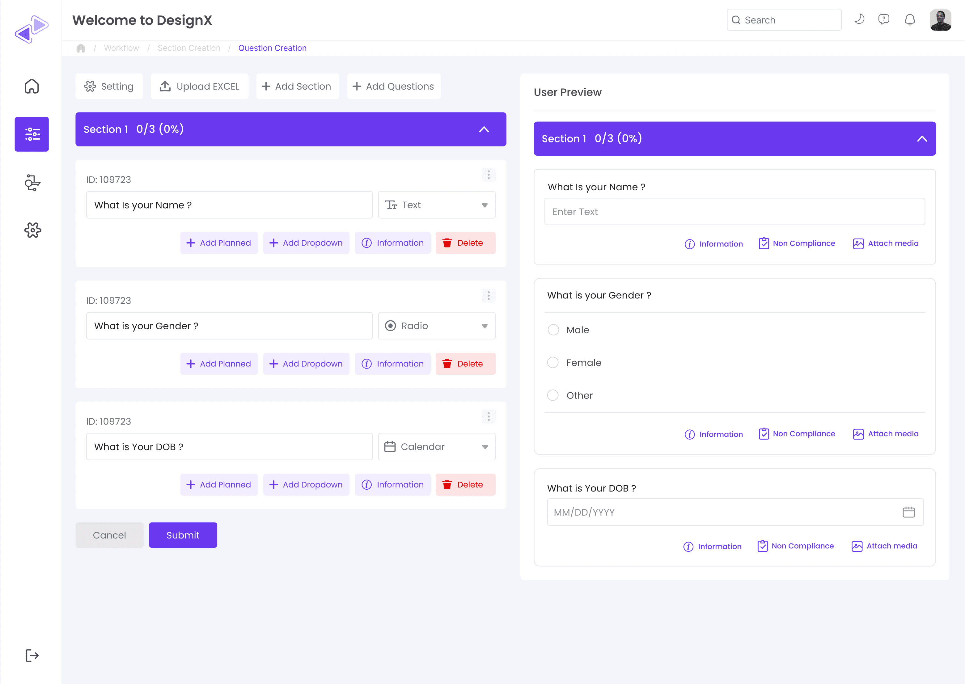
Introducing Live Preview
The preview panel so users could see how the form would appear while creating and configuring questions.
What worked
Instant visual feedback.
Easier to validate answer types.
Increased confidence before publishing.
Reduced potential form configuration mistakes.
Issues
Preview occupied valuable workspace.
Users still had to switch between editor and preview.
Answer configuration required multiple clicks.
Long forms required excessive scrolling.
Key Learning
Preview improved confidence, but separating preview from creation still created friction. The editor itself needed to become the preview.
Iteration- 4
Final Iteration — Unified Builder
Instead of separating editing and preview, users now build the form directly on the final canvas.
What worked
Inline editing reduced unnecessary switching.
One-click actions made editing faster.
Persistent configuration panel simplified settings.
Sections and question counts improved navigation.
New Features & Improvements
Multi-language Support — Enabled forms to scale across different languages and regions.
Bulk Excel Upload — Allowed users to create hundreds of questions at once instead of adding them manually.
Undo / Redo — Made editing safer by allowing users to quickly reverse or restore changes.
Unified Settings — Brought all form and question settings into one screen, reducing navigation and clicks.
One-Click Actions — Made duplicate, delete, reorder, and question-type changes faster.
Unified Settings — Brought all form and question settings into one screen, reducing navigation and clicks.
Key Learning
The best experience wasn't about adding more functionality—it was about bringing creation, configuration, and preview into one seamless workflow.
Imapact
100% Self-Service Adoption
Manufacturing Operations teams could create and update forms independently, eliminating the need for the Curator Team for routine form requests.
Reduced Internal Manpower Cost
By removing the Curator Team as a dependency for every form change, we reduced the amount of internal time and manpower required to support client requests.
Scalable Operations
As the number of clients and forms increased, the business could support additional form creation without proportionally increasing the Curator Team.
Explore More Case Studies
Follow up case study
Explore individual case studies to see how specific features and screens were redesigned throughout the DFOS project.

Mobile App Redesign
Redesigned the mobile experience to simplify field and enable faster task completion on the go.
Coming Soon
